Drift Marketplace
BUILDING AND DESIGNING A PRODUCT FROM SCRATCH TO CONVEY THE VALUE OF GREEN ENERGY AS A SERVICE (EaaS)
MY ROLE
Product Management | Creative and Design Direction | Event Management
THE CHALLENGE
Explaining the importance of running on 100% renewable power is complex and abstract.
THE SOLUTION
Define a product positioning and design that consistently humanizes Drift’s platform and makes it easier to understand for ‘green lovers.’
About the brand
We approached the task in an agile way for many reasons. Drift is a startup with limited resources, budget and time. In three months we:
1. Defined the brand and tone of voice with a focus on educating audiences
2. Redesigned the website and platform with a focus on humanization through environmental impact.
3. Conceptualized and produce a campaign activation for the event
We set off to learn what the business needed during a period of evolution. Working from an initial brief, our team interviewed internal members of our staff, existing customers, investors and companies that felt empathetic to Drift’s vision. We researched other brands, in the USA and overseas to get an understanding of how other renewable companies were presenting themselves.
Brand System
Our brand system is made up of six elements: Logo, color, typography, iconography, tone of voice and imagery

Our logo and our name is inspired by the movement of birds flying in unison, intricately coordinated. V-shaped formations help birds conserve energy.

How we speak:
Simple, Honest and Transparent.
How we act:
Bold, Celebratory, Collaborative.

Our color palette is the interpretation of a combination of technology and the earthier colors of green electricity sources (wind, sun, water.)

Both typefaces were selected to project our tone of voice. They are both easy to read and unassuming, but with enough personality to deliver a message of honesty and transparency.

Our illustrations are created by the Thomas Danthony, bringing a sophisticated and artistic craft to our designs that differs from the usual approaches in the industry.
Iconography is key to our brand to represent sources of renewable energy, environmental impact, etc. in ways that are understood at a glance while removing the complexity of a highly abstract concept.
The Website


The website was redesigned with bold colors and a very unique tone of voice from other energy sites. The intention was to ‘humanize’ the sector, and better reflect our modern and customer-centered approach to an innovative energy marketplace.
We built a custom dashboard that updated hourly with information about where the electricity was coming from, the type of energy and the amount of positive impact to the environment by using 100% renewables. That kind of information was critical to promote transparency and it was born as a combination of users’ feedback and the inspiration from products outside of the industry.
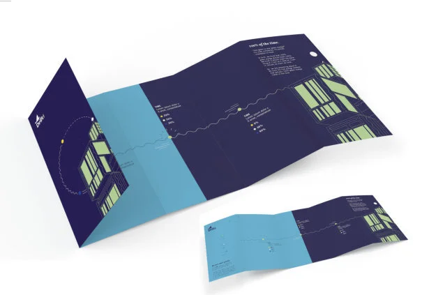
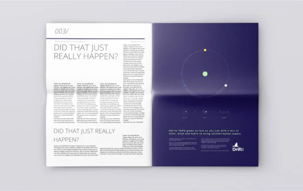
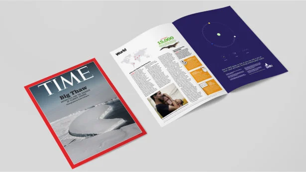
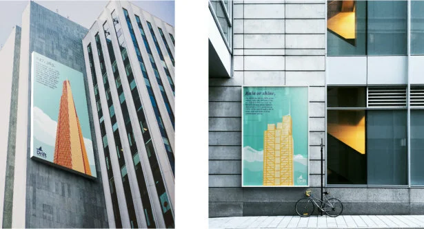
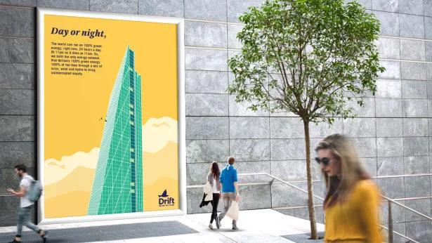
Marketing Materials
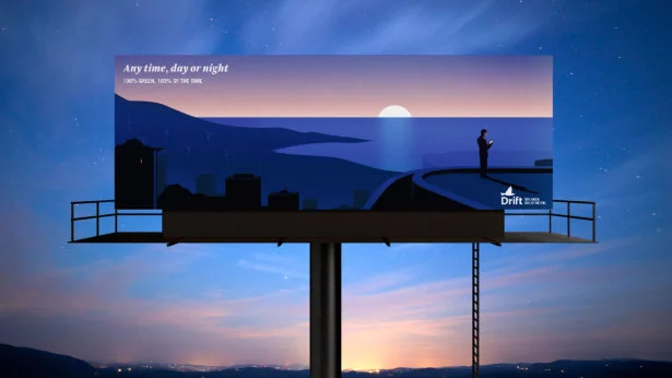
These are some examples of potential applications, from brochures to magazines and advertisements. The overall system gives us enough flexibility to remain playful and incorporate just the right amount of drama depending on the occasion. But all of them still have a strong cohesiveness, currency and are memorable.


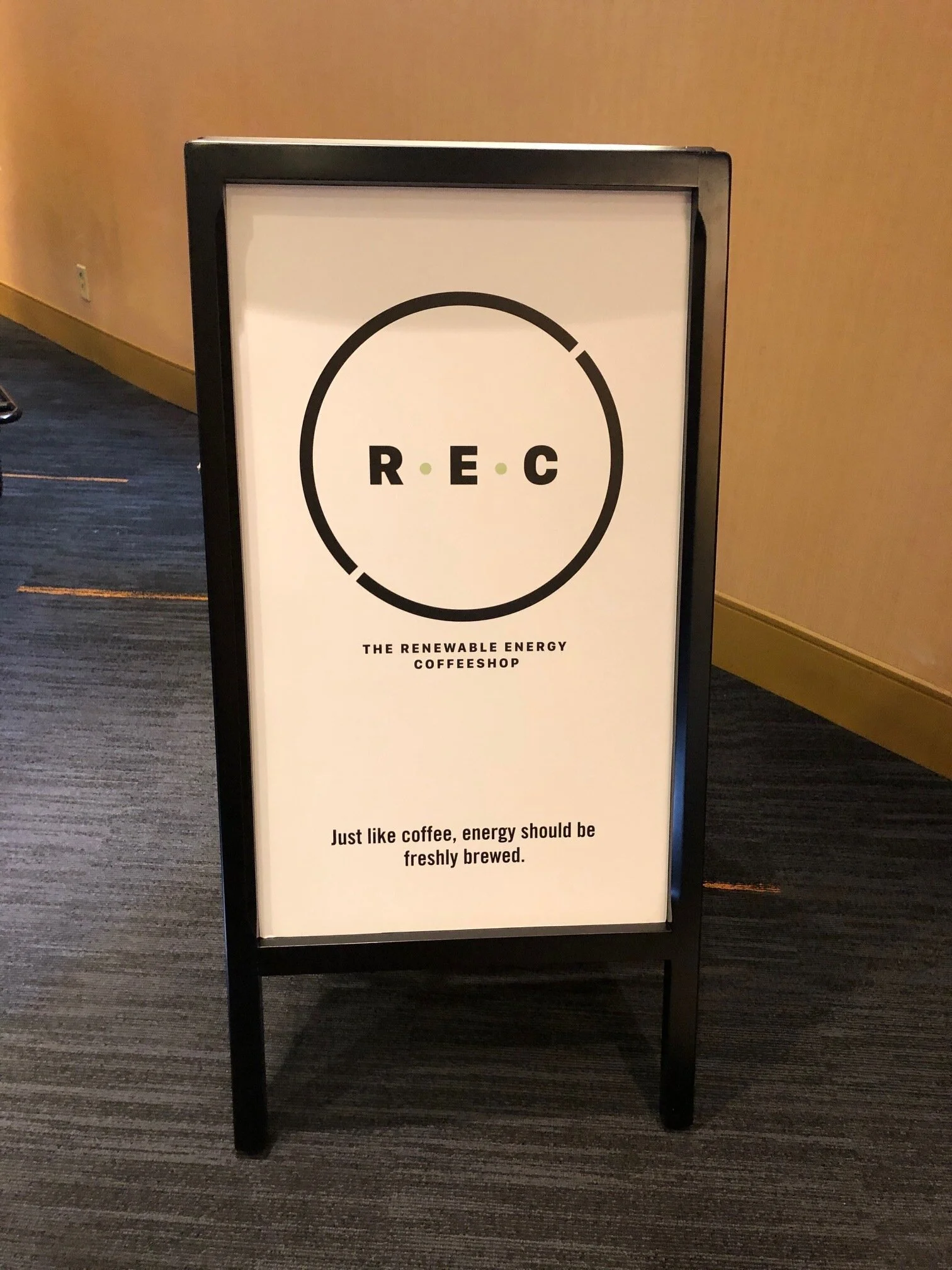
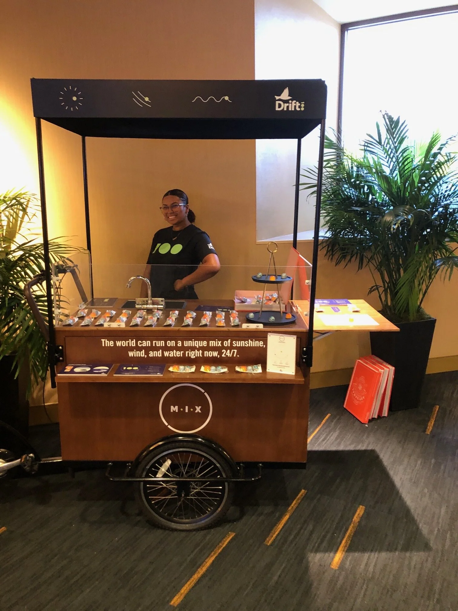
REBA 2019, Oakland CA | Campaign activation
RENEAWABLE ENERGY COFFEE - REC Coffee Branded Cart.
We were looking to create a memorable experience at a conference where not very often the unexpected happens.
REC in the industry means Renewable Energy Credits.
To connect with the knowledgeable audience at the conference, we transformed it into Renewable Energy Coffee. It was witty and interesting.
We served two types of coffee. One of them was made three days ago. The other one was made ‘now’. The point we were driving was that energy is not different from coffee. To get to 100% renewables, we need to consume the electricity that’s produced at the same time we consume it. Not different from coffee ;)
Bringing a very complex, abstract issue to a level everyone is familiar with helped us educate the audience and get the point through.
We also had three types of chocolate representing the different types of power. They were beautiful and delicious.


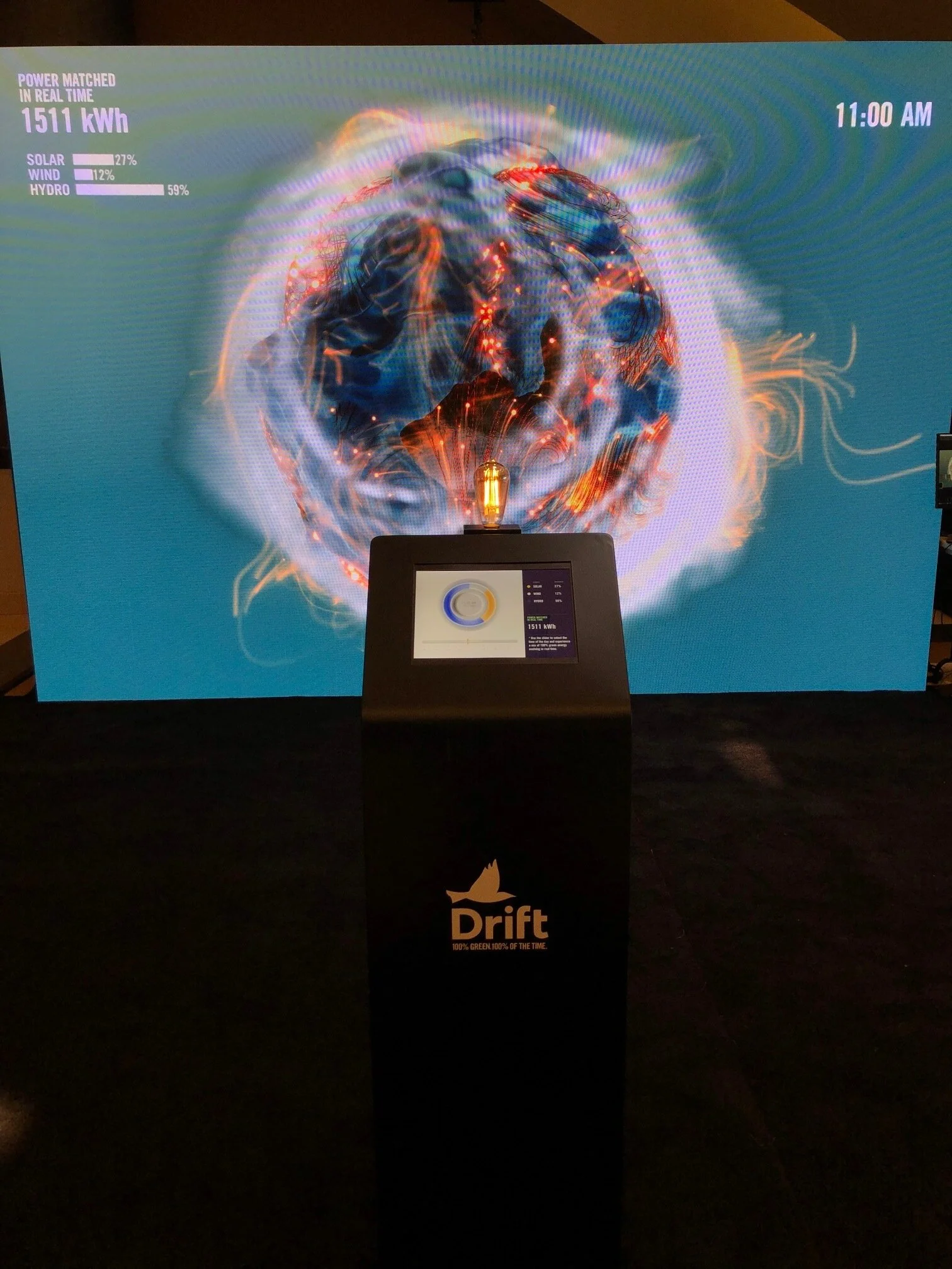
Interactive Real Time Electron
On the other side of the facility, we install our 24/7 Electron Wall and interactive installation.


The Electron began in a simplified dormant state, void of color and lacking energy, yet elegant and mesmerizing. An ambient animation will slowly move and shift, waiting to be activated. Once a user engaged with the control panel, the Electron will come to life, bursting and bubbling with energy swarming around it. Each energy source the electron draws from will modify the look of it’s surface, visually portraying the shifts in its power sources as the time of day is adjusted.