Making the abstract a bit more concrete
Conveying the value of 100% renewable electricity
THE CHALLENGE
Explaining the importance of running on 100% renewable power is complex and abstract.
THE SOLUTION
Define a brand positioning strategy to codify how Drift can be recognized as a leader in renewable power. Create a strategy and a brand bystem that allow all our communication to speak in one consistent voice.
Brand summary
We approach the task in an agile way for many reasons. Drift is a startup with limited resources, budget and time. Also, we were going to be sponsoring one of the most prestigious events in California. We needed to be ready in three months to:
1. Define the brand and tone of voice
2. Redesign the website
3. Conceptualize and produce a campaign activation for the event
The Family
We set off to learn what the business needed during a period of evolution.
Unifying brand personality:
- Engaging
- Smart
- Flexible
- Friendly


Color
While color evokes an emotional response, the colors chosen have a rational basis for selection. Color provides a consistent visual language that aids in brand recognition. Each color palette has been chosen to reinforce the overall brand objectives, the individual site content and individual site demographics.
For each palette the colors are plotted on an quadrant, measuring hard, soft vertically and cool, warm horizontally. Words associated with these colors are also noted.


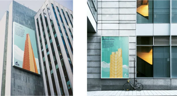
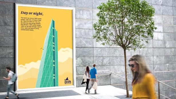
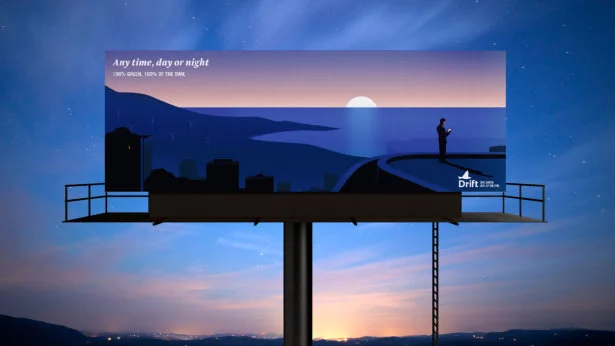


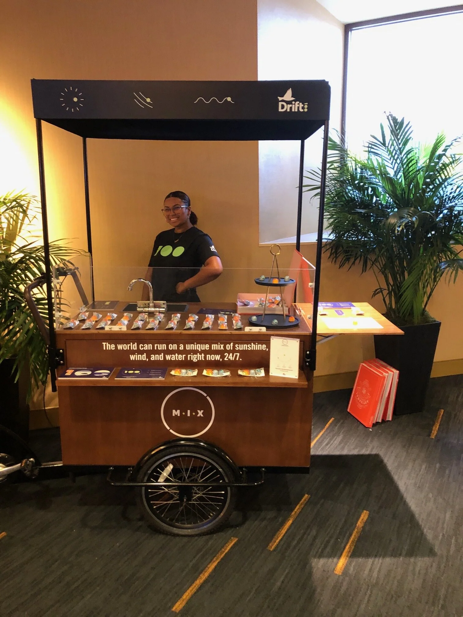
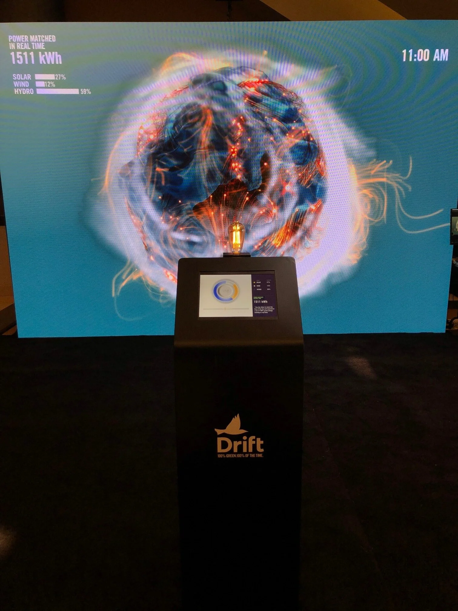
REBA 2019, Oakland CA | Campaign activation
Exclusion zone
The nwapartments identity requires space around it in order to maximize its presence. A protective exclusion zone prevents encroachment of any graphic elements from interfacing with the integrity of the mark. The exclusion zone is equivilant to the “x height” of the identity.
One color versions
To facilitate the mediums where there is limited color capabilities, the following versions of the identity should be used.
Typography
The typographic portion of the identity is Bauhaus Medium The Strada typeface family may be used for affi liations, taglines, online graphic elements and collateral materials. If Strada is not available, a typeface such as Arial or Helvetica may be used for applications such as email.
The Website


Interactive Real Time Electron
On the other side of the facility, we install our 24/7 Electron Wall and interactive installation.


The Electron began in a simplified dormant state, void of color and lacking energy, yet elegant and mesmerizing. An ambient animation will slowly move and shift, waiting to be activated. Once a user engaged with the control panel, the Electron will come to life, bursting and bubbling with energy swarming around it. Each energy source the electron draws from will modify the look of it’s surface, visually portraying the shifts in its power sources as the time of day is adjusted.